The Component Garden

A playground to build innovative user interfaces, single components and animations. For us, to have fun and experiment, and for you to learn and dive into the world of animations and user interactions.
Welcome to The Component Garden, an open-source playground repository where we build and showcase innovative user interfaces, components and animations. This project serves as our sandbox to experiment with new design trends, while keeping a critical eye on the usability and accessibility of our components.
We are taking the chance to talk a bit about our first implemented component: the card deck.
The Card Deck
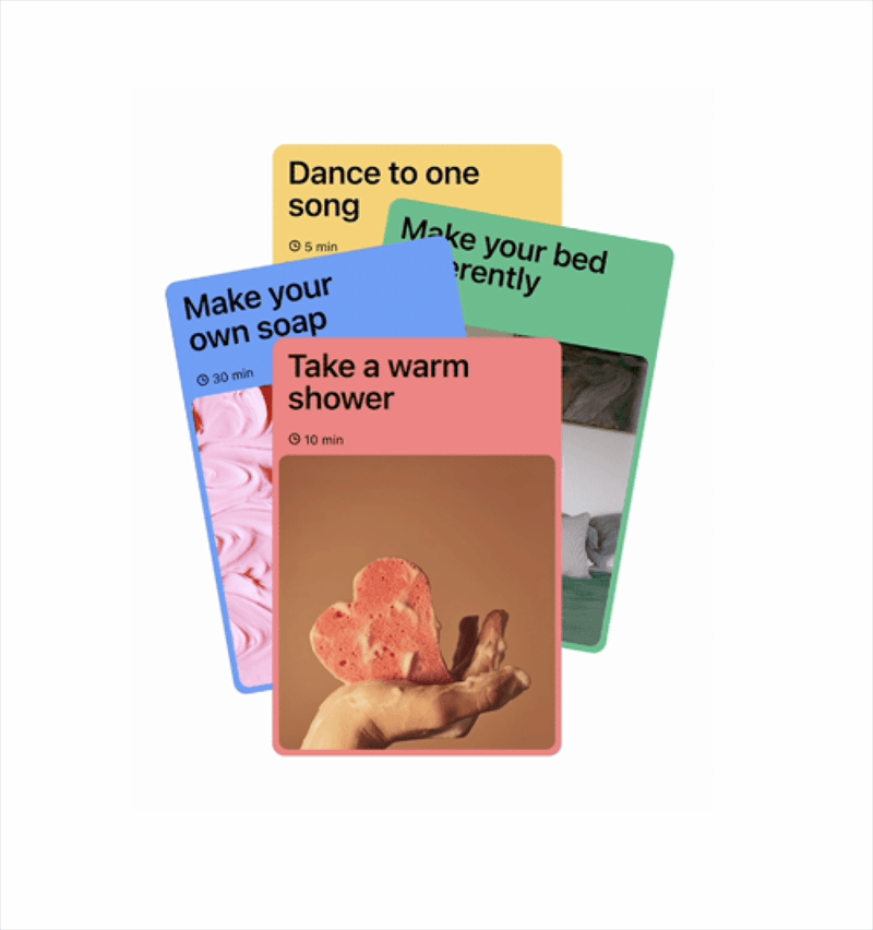
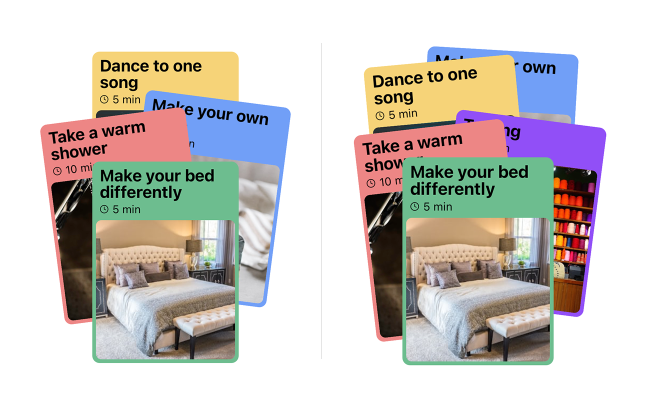
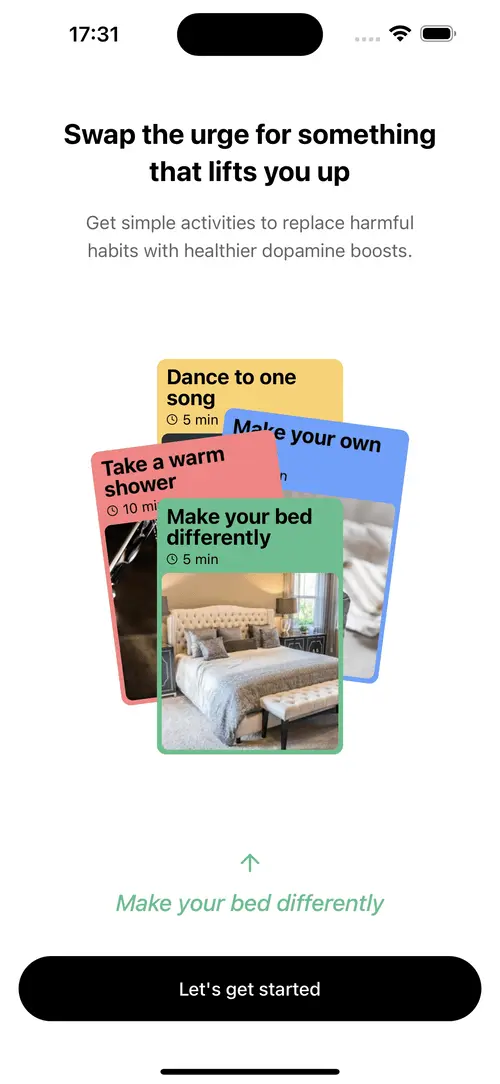
Let’s start by understanding the component. It’s designed by Daria Po and by its title it seems like its original purpose is to be part of an onboarding step, rather than an interactive deck of cards. However, we wanted to give it a try and see if we could make something more real from it.
The original design is snappy and satisfying. We decided to try to get the same feeling while making the component fully interactive.
The analysis
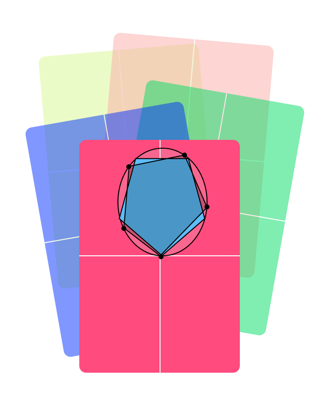
Before writing a single line of code, it’s important for us to understand the component’s geometry. We transposed the key frames of the animation to Figma and analyzed their positioning.
The resting position shows four cards distributed along a vertical ellipsis. At first glance, it might be tempting to place the cards at equal distances from each other. However, by looking at the center of the cards, we realize there is a slight visual adjustment to make the cards look more like a deck.
Carefully analyzing the positioning of the cards reveals that their center are within a vertical ellipse. What’s more, elements not in the center vertical axis are slightly displaced on the oval in clockwise direction.
By imagining what it’d look like for five cards, we get a better feeling of the math behind the component.
For the positioning to work with 5 cards we follow the same principle, cards on the left are slightly adjusted down (or clockwise) to make sure they are not overlapping in an imaginary third dimension.
It seems like our intuition is correct, the cards still resemble that deck of cards and now we have some rules for positioning them in the Cartesian plane.
Perfect! Now for the fun part, moving things around. We studied the animation in slow motion, only to realize that it’s simpler than it looks. Let’s run the exercise, focus on one card, and one card only, and see what happens when it moves.
Exactly, the cards move horizontally to get some distance between them, and then move linearly to the next position of the geometry we defined early. There is a bit of genius here: by moving the cards apart, there is a brief moment where we can move the cards in the z-axis without the user noticing a jump.
And with that, we are ready to start coding.
The implementation
We worked on the two main parts of the component: positioning and animation.
As for the positioning, we already did the heavy lifting by drawing the cards in Figma. It’s just a matter of some basic trigonometry to get things right. I’m not going into a full code review here, but the most important functions are the following ones:
/**
* Determines the angle in the unit circle given the positional index of the
* item and the total number of items we expect to show.
*
* This function adds some variability on items that are not aligned with
* the vertical axis. This gives the item a more natural deck-ish style.
*/
const angleForIndex = ({
  index,
  numberOfItems,
}: {
  index: number;
  numberOfItems: number;
}) => {
  "worklet";

  /**
   * We start with an equilateral polygon
   */
  const baseAngle = ((2 * Math.PI) / numberOfItems) * index;

  /**
   * Then we adjust the angle for cards other than the front one and the
   * back one (for an even number of items)
   */
  const isFirstCard = index === 0
  const isMidCard = index === numberOfItems / 2 && numberOfItems % 2 === 0

  const adjustmentAngle =
    isFirstCard || isMidCard
      ? 0
      : -Math.PI * 0.05;

  return baseAngle + adjustmentAngle;
};
For the z-index position and the card rotation we went for straightforward algorithms:
/**
* This function calculates the _depth_ of the item. Items closer to the bottom
* edge of the screen are _closer_ to the user.
*/
export const getZIndexForItem = ({ coords }: { coords: Coordinates }) => {
"worklet";
return Math.round(coords.y * 100);
};
/**
* To calculate the rotation/tilt for each card we just calculate how far from
* the vertical axis they are. We have multiple parameters to limit how much they
* tilt.
*/
export const getRotationForItem = ({
coords,
maxWidth,
maxCardTiltInDegrees,
}: {
coords: Coordinates;
maxWidth: number;
maxCardTiltInDegrees: number;
}) => {
"worklet";
return (coords.x / maxWidth) * maxCardTiltInDegrees;
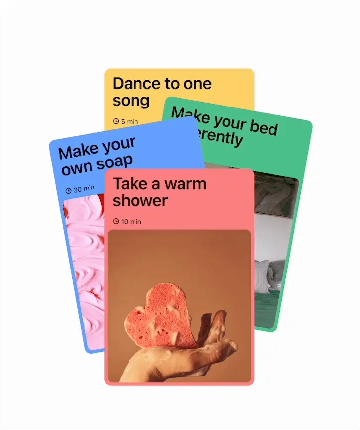
};And here is the result of these calculations:
With this simple positioning technique we manage to place four and five cards just as we planned.
The animation is more tricky, but still doable. We have splitted it into two different problems: the animation while the user is dragging the cards, and the animation when restoring their position.
For the dragging gesture we used the omni-present react-native-gesture-handler and its Pan gesture. This library provides a more native feel to gestures compared to React Native’s built-in gesture responder system. We paired it with react-native-reanimated to achieve a smooth and springy animation.
The idea here is to keep a dragProgress shared value that we then send to each item for them to calculate their exact position. I included an overly-documented snippet here with the way we calculate shared values:
const [selectedCardIndex, setSelectedCardIndex] = useState<number>(0);
const dragProgress = useSharedValue(0);
const isDragging = useSharedValue(false);

const pan = Gesture.Pan()
  .onBegin(() => {
    isDragging.value = true;
  })
  .onChange((event) => {
    /**
     * We calculate the new progress value using a linear interpolation
     * function. The idea is to limit its value to be between -0.5 (for
     * left dragging) to 0.5 (for right dragging).
     */
    const newProgress = interpolate(
      event.translationX,
      [-width, width],
      [-0.5, 0.5],
      Extrapolation.CLAMP,
    );

    dragProgress.value = withSpring(selectedCardIndex + newProgress);
  })
  .onFinalize((event) => {
    /**
     * When the pan gesture finishes, we calculate if the user dragged
     * enough to change the selected card. If not, we restore the original
     * position.
     */
    const newProgress = interpolate(
      event.translationX,
      [-width, width],
      [-0.5, 0.5],
      Extrapolation.CLAMP,
    );

    const finalizedProgress =
      newProgress <= -0.2
        ? selectedCardIndex - 1
        : newProgress >= 0.2
          ? selectedCardIndex + 1
          : selectedCardIndex;

    dragProgress.value = withSpring(finalizedProgress);
    isDragging.value = false;
    scheduleOnRN(setSelectedCardIndex, finalizedProgress);
  });
You can see we create a shared value called isDragging to keep track of the gesture lifecycle. This allows us to jump into the second step of the animation: the restoration of the cards’ position when the gesture finishes. When the gesture finishes, we first calculate the new position of the cards (depending if the user dragged enough to change the selected card or not), and then we let reanimated do its magic with a spring animation.
With that we are done! The animation feels snappy and fun.
The animation is a bit more spring-ish than the original. This was a conscious choice; the tension it generates while dragging was asking us for a great release when the user ended the gesture.
Final words
In this post we went through the implementation of our first crop for The Component Garden. We will keep using this project to explore advanced UI and animation techniques, and we will use it to build them in public so that others can learn with us.
If you want to learn more about the project, check out the GitHub repository.